


Choosing a Frame Colour: Black, White, Oak and Walnut
September 8, 2026 · updated September 8, 2026
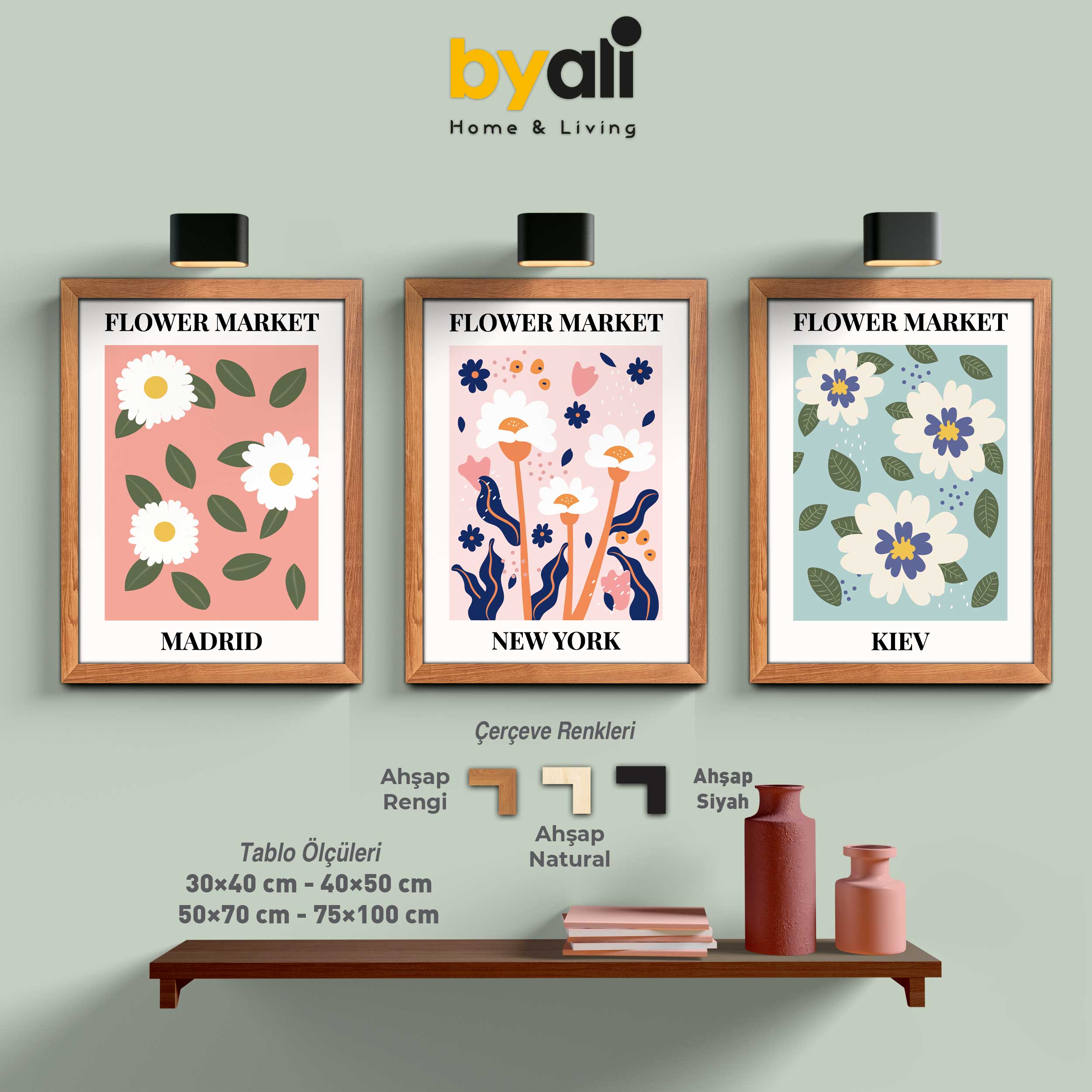
Frame colour is the last thing most people think about and the one that changes the result most. The same image looks graphic and sharp in black, warm and calm in oak.
Look at the wood, not the wall
The common mistake is matching the frame to the wall colour. Match it instead to the wood tones in the room: the coffee table, shelves, floor, door frames.
Black
The safest choice. It separates the image from the wall, sharpens its edge and gathers the darker tones in the print. First choice for modern, minimalist and graphic work, and for black-and-white photography.
White
Softens and lightens. On pale walls the frame almost disappears and all attention goes to the image. Works well with pastel, boho and children's room prints.
On a very dark wall a white frame does the opposite: the frame itself steps forward.
Oak
Light, natural wood. At home in Scandinavian and natural-toned rooms and with pale flooring. Adds warmth to botanical, landscape and earth-toned images.
Walnut
Dark wood with a reddish cast. Suits classic furniture and darker floors. With famous paintings and vintage imagery it supports the period of the work.
Can you mix colours?
Mixing frame colours on the same wall is risky, and panels within one set should always match. Different colours in different parts of the room are fine.
Three questions
- Is the wood in the room light or dark? → Oak for light, walnut for dark.
- Is the image itself busy and colourful? → Then black or white, so the frame stays quiet.
- Should the piece stand out or blend in? → Dark to stand out, close to the wall colour to blend.
Every product page shows all four frame colours and a Frame Details section. Browse by style: famous painters, botanical, abstract.